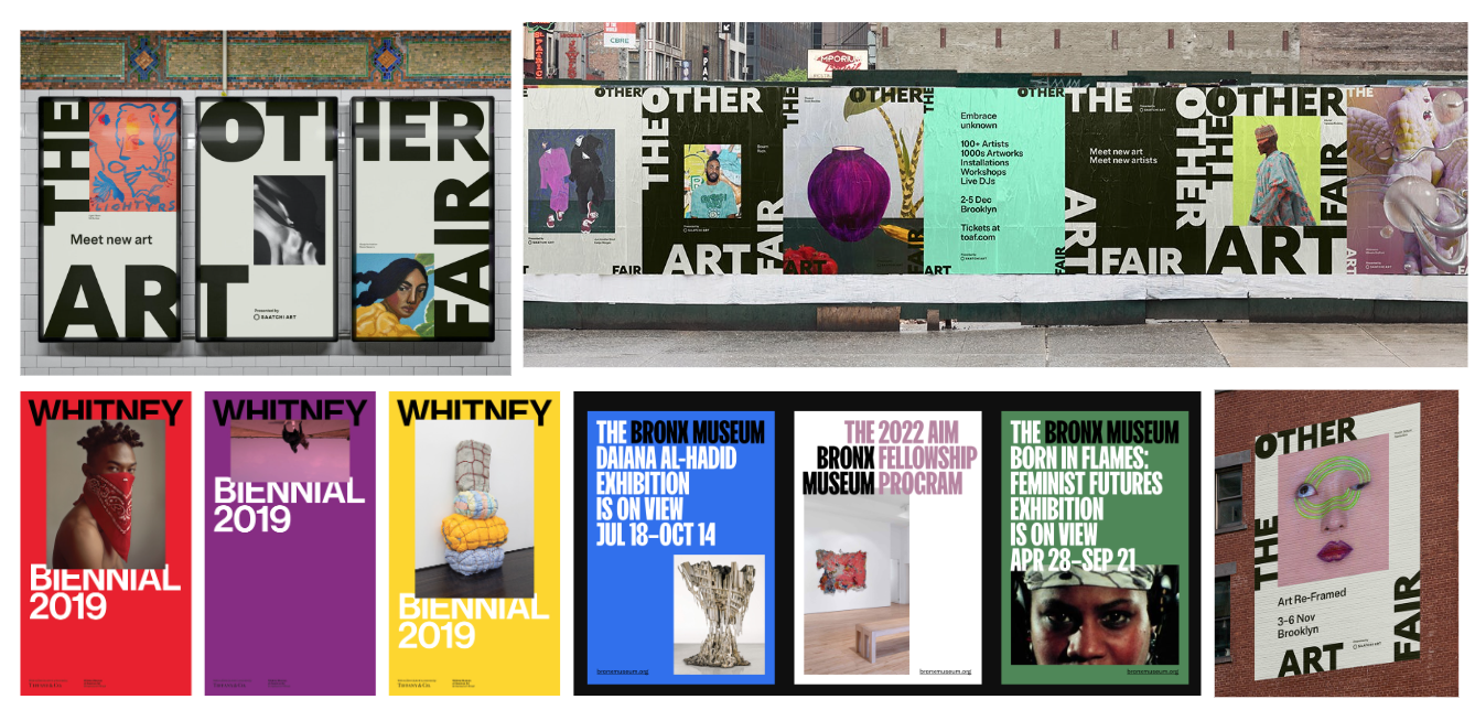
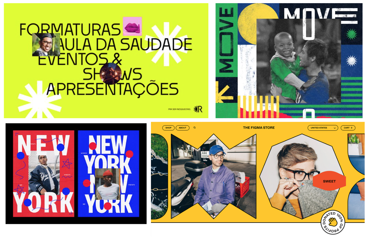
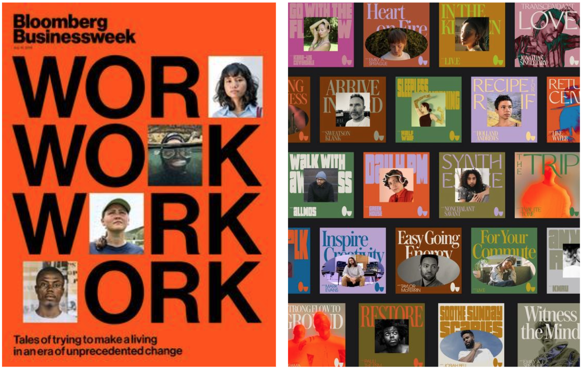
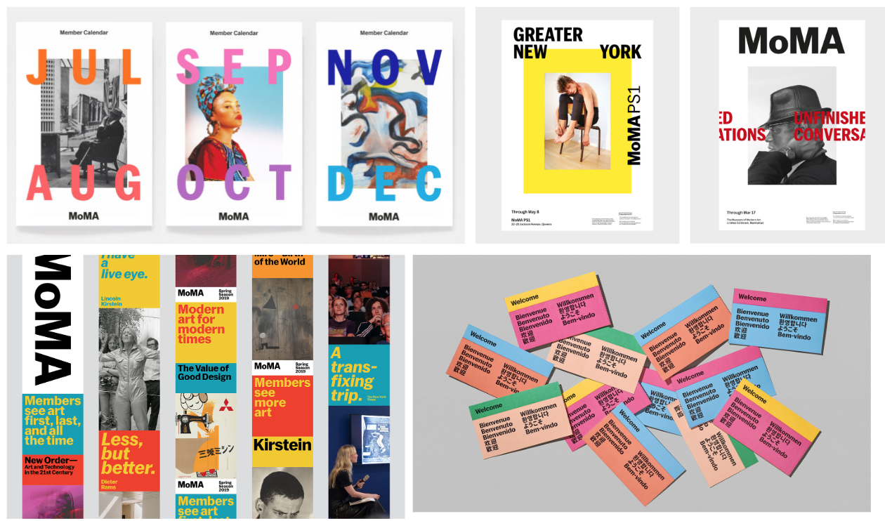
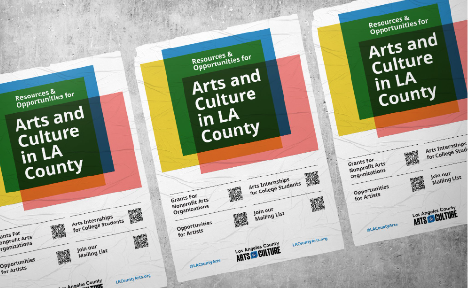
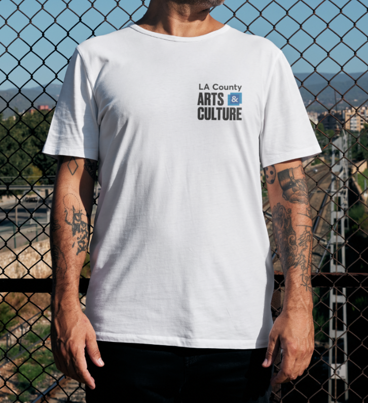
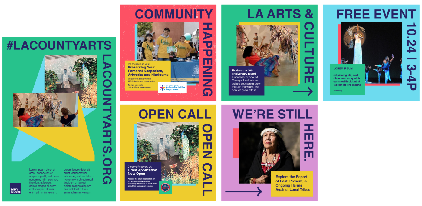
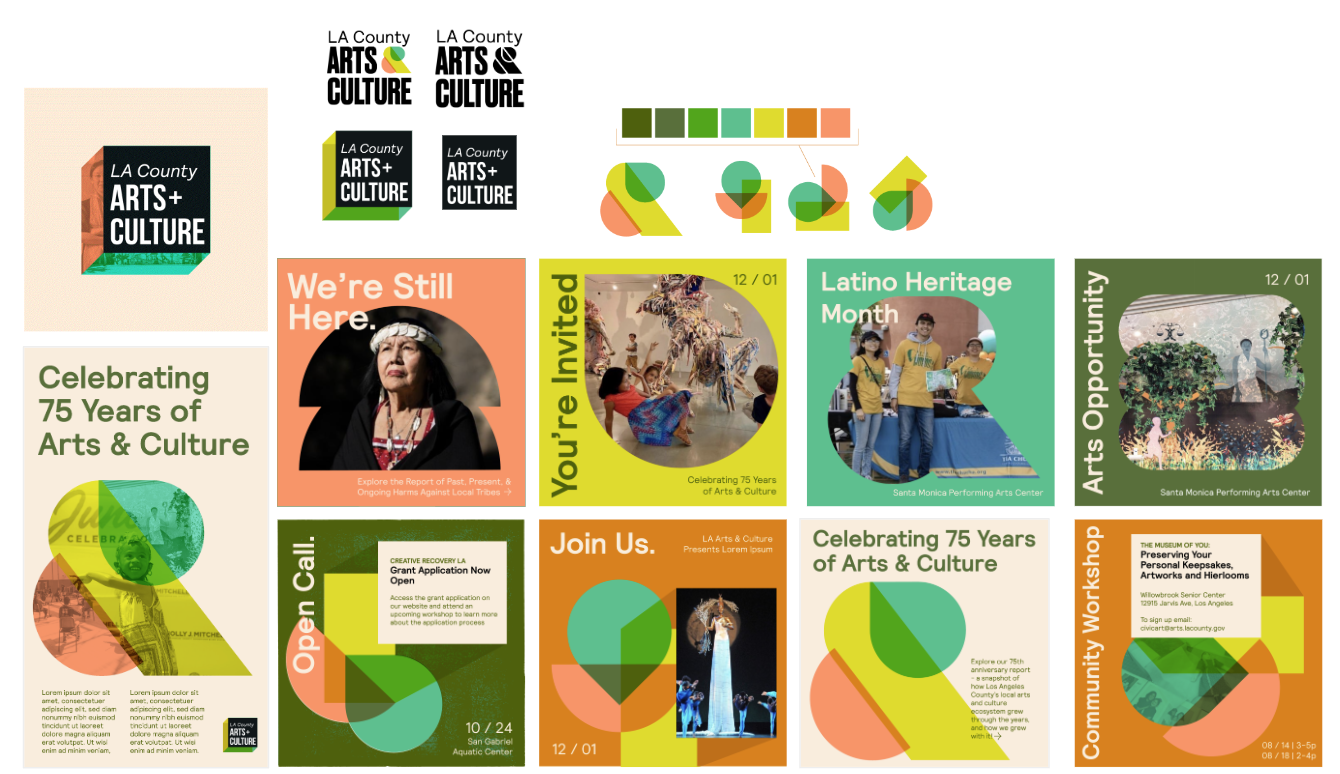
We worked for nearly half a year with Los Angeles County’s Department of Arts and Culture on a wide-scale rebrand. They wanted the brand to feel youthful, but not trendy, bold but still institutional, and bright but serious. Since the department showcases many disciplines of art across a variety of communities through in-person programs, live events, and public art we needed to devise a brand system that could translate across multiple platforms and use cases. We also needed to make sure that the out-of-home could easily translate into social graphics as well as printed reports, fliers and power point presentations.
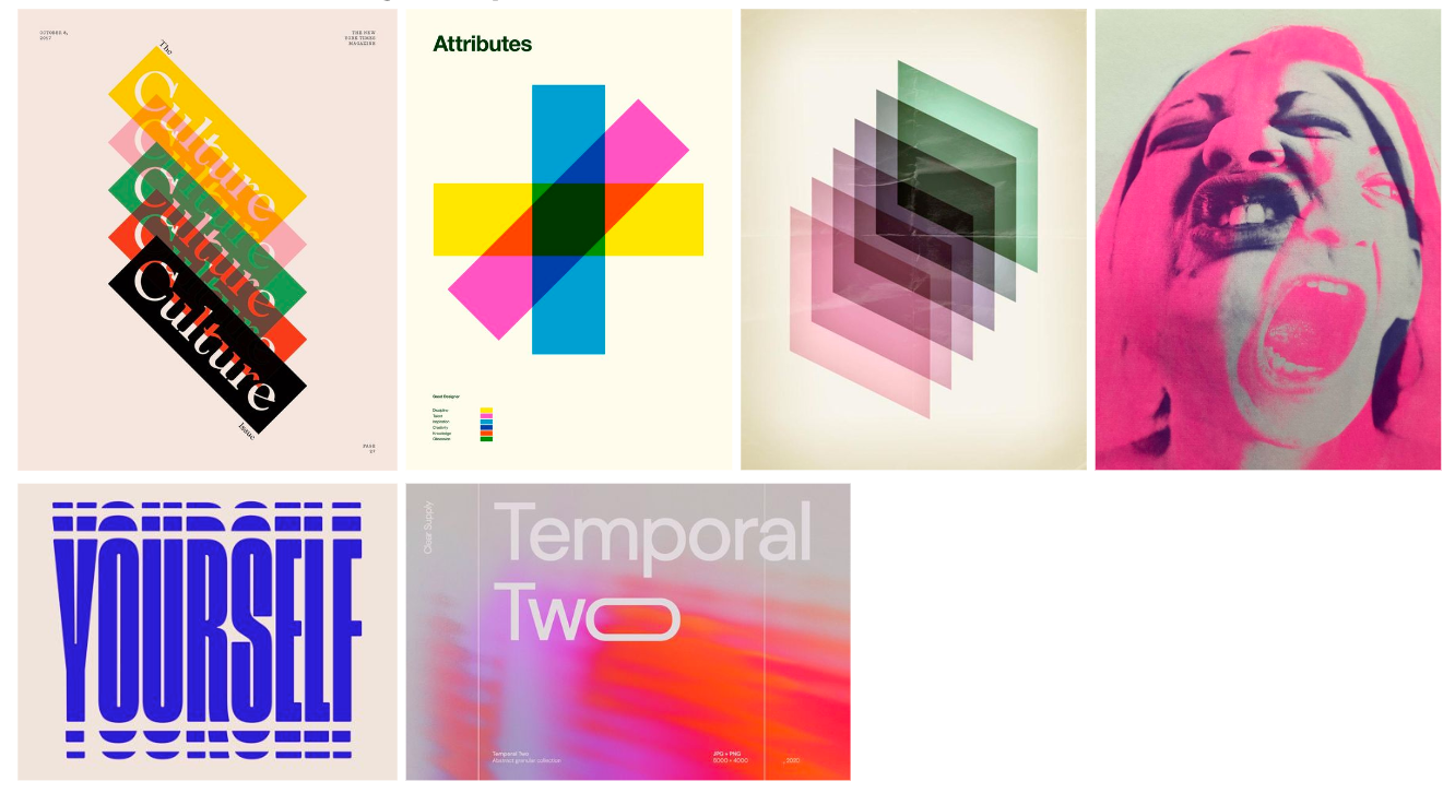
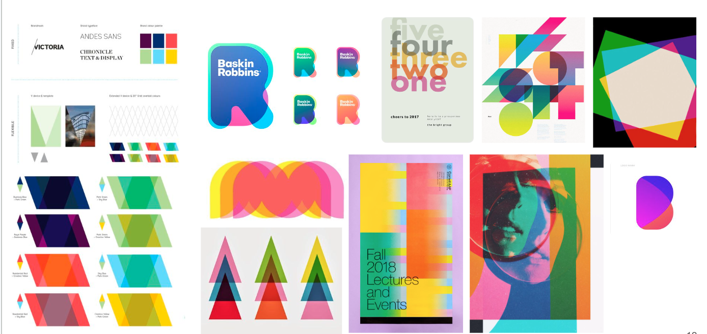
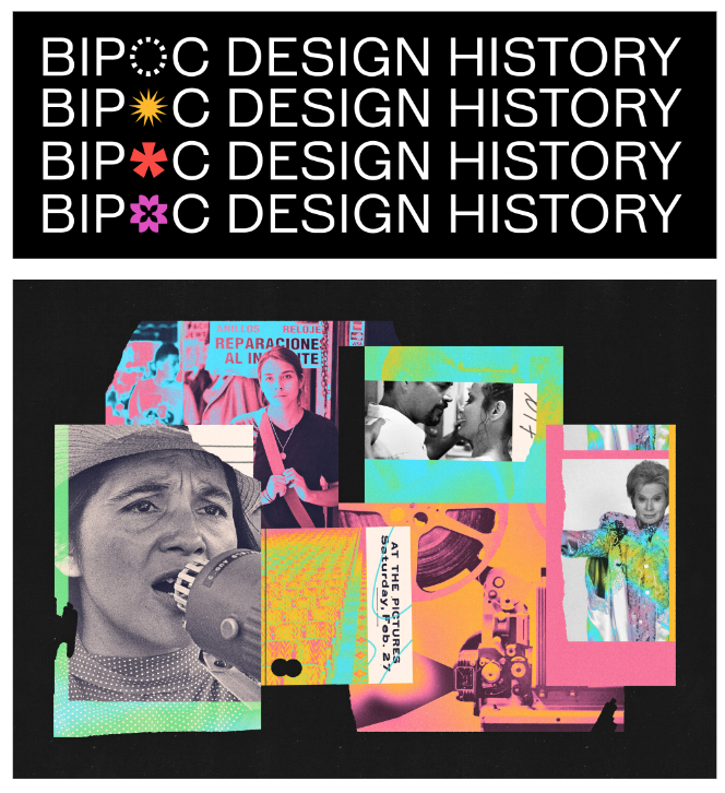
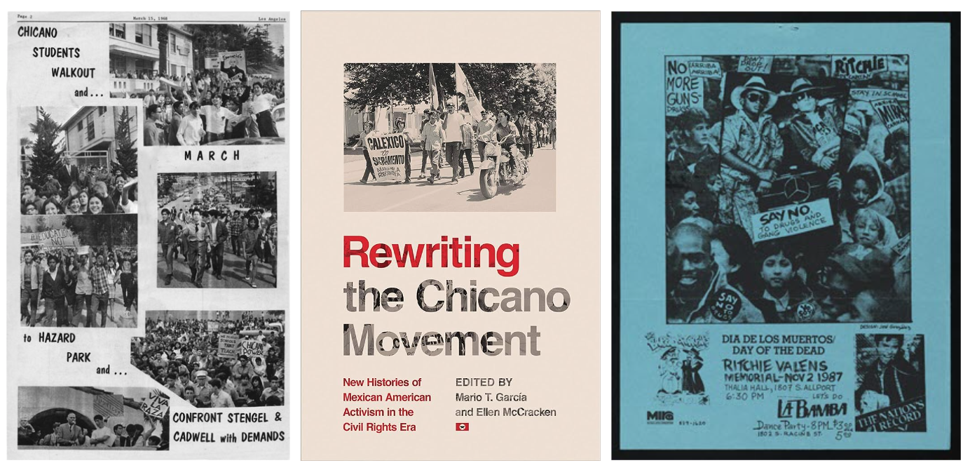
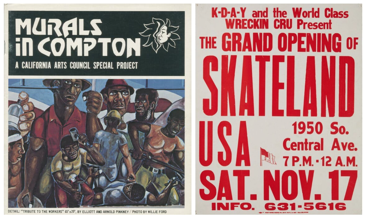
We began with a ton of research around current art institutions, culture around Los Angeles and did a deep dive into the BIPOC art scene in L.A. from the 60s-2000s. We also performed a full brand audit and created a brand mission, audience, personality, and tone based on the internal department surveys.
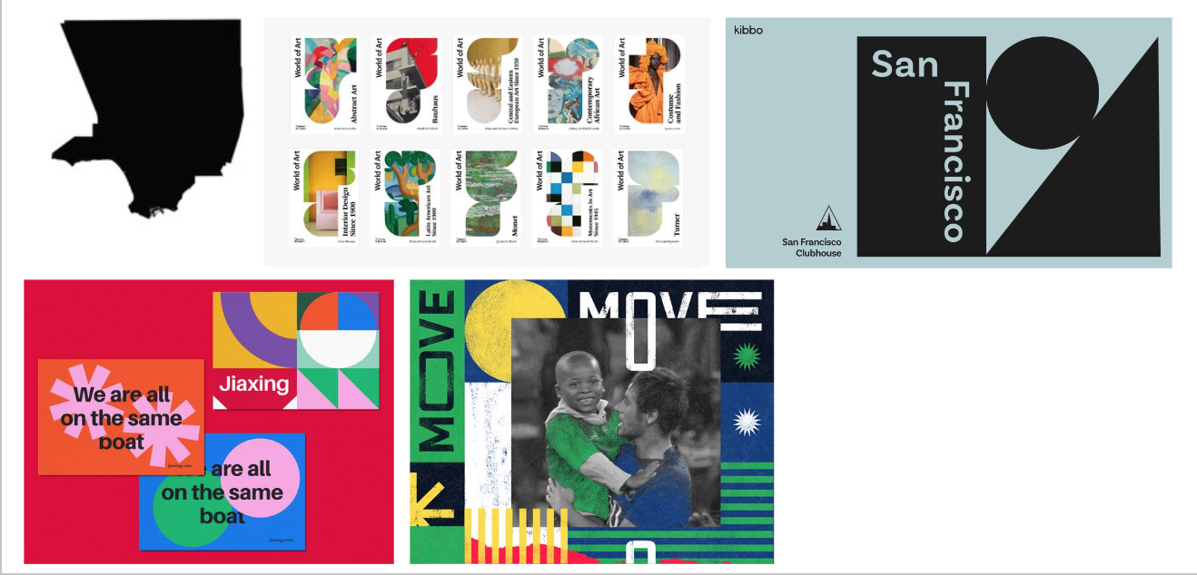
Design-wise, we started with logo exploration that took us from using the shape of L.A. county, to referencing letterpress posters, to a straightforward adaptation of their previous logo and eventually found ourselves with three main directions to explore: Layers (referencing the many layers of the department, the layers within each community, and the process of art itself), The Shape of L.A. (using shapes inspired by L.A. foods, buildings and nature), and Stamp (a big, bold approach using a stamped logo on each creative piece to show that its brought to you by and approved by LAC).
After fleshing out each direction, the client narrowed it down to Layers and Stamp, ultimately combining them into one direction. We took colors from the Los Angeles landscape so that the assets felt bold, but familiar. Ultimately the most important part of the brand is the ability to highlight the artwork and artists so we wanted to elevate the artwork (literally) as the top layer of each asset. We also needed to make sure that the logo would work with various partner logos in situations like social media and step-and-repeats.
We landed at a place where Los Angeles County Arts & Culture sits at the intersection of communities and art - hence the ampersands being in between the two blue blocks (the squares and color calling back to the original logo). Whether its a report, tote, business card, wheatpaste, lampost or power point slide, we wanted to make sure that each deliverable included the idea of layers in some way.
Los Angeles County Arts & Culture Rebrand
Client
Taskforce & Los Angeles County Arts & Culture
Role
Creative Director
Designers
Ariel Wilson, Pablo Medina
Producer
Pascale Cardozo
Year
2024
Before

After


Design Development
Logo Exploration
Design Exploration
Research
